We have speculated often over the past year that long-dated US bonds were near the end of their unprecedented 36-year bull market. More evidence continues to show up that the trend has begun to shift and that what we have called the "bond bubble" of the last decade is set to begin deflating.
We have speculated often over the past year that long-dated US bonds were near the end of their unprecedented 36-year bull market. More evidence continues to show up that the trend has begun to shift and that what we have called the “bond bubble” of the last decade is set to begin deflating.
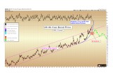
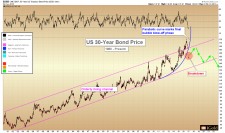
The chart below shows the price of 30-year US bonds from 1980 through the end of 2016. Note that yields, which are currently just under 3.0 %, move opposite to the bond price.
The final phase of the bubble has coincided with a parabolic rise in the price of bonds since 2011 (shown in blue). Parabolic curves typically define the final stages of a bubble or mania, and the price escalates ever upward in an unsustainable fashion after what was an orderly bull market in years past.
Note the breakdown that has just occurred over the last month, with bond prices piercing the parabolic curve decisively lower. We do not anticipate a collapse in bond prices imminently, but rather a new trend of lower prices and higher yields to begin developing over the coming years.
(See image A)
It cannot be overstated how important this shift toward lower bond prices and higher interest rates will be for the majority of world citizens, as the United States — and by consequence many allied governments — have become addicted to the cheap credit supplied by an ever-willingness of bond investors to loan the US government money at ever-lower interest rates.
Everything from national defense, to our financial system, to our social welfare programs, to our real estate markets, have been given their capacities and valuations by the availability of cheap credit via the bond market. All investors who have been active in any market for 36 years or less know only falling interest rates as their financial backdrop.
This paradigm is soon to be flipped upside down, and after a generation of falling rates, it is not inconceivable that a generation of rising interest rates is set to come.
__
Gold Versus Bonds
(See image B)
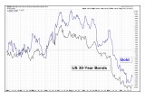
We should note that for much of 2016, and especially during the second half, both gold and US bonds have been moving in tandem, rising during Brexit and falling after the Trump victory.
Notwithstanding the slight outperformance by gold, both were considered “safety assets” and investors generally bought and sold both assets together.
This may lead some investors to fear that gold will continue to decline with bonds, if the bond bubble has burst.
Over the long run, we must state that gold and bonds are intrinsically located on opposite ends of the safety spectrum. While gold has represented money and retained its value for over 5,000 years of history, bonds are essentially paper contracts which are, in many respects, an inferior asset than even US dollars during an inflationary episode.
Whereas US dollars can at least be used now and converted into tangible assets, bonds represent a set number of US dollars to be paid in the future.
Through studying historic inflationary periods, from the 1920’s in Weimar Germany to the 1970’s in the United States, we learn that such episodes, the single worst asset to hold is a bond. Meanwhile, precious metals tend to be the best performers. So while gold and bonds are currently being viewed by the market as both generic “safety assets”, this correlation will not continue indefinitely.
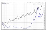
Below we can see that the above relationship, when viewed over a proper timeframe, yields a different perspective: since the bond bull market began in 1980, gold moved opposite it for the first 20 years, only to play catch up from 2000 onward, followed by the brief period of high correlation seen recently:
(See image C)
__
Gold’s Long-Term Outlook
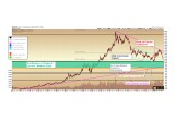
Backing out our typical short-term perspective of gold spot price for the longer-term view: we continue to believe that the zone shown in green, between $850 – $1,045 as defined by the confluence of the four important technical levels labeled on the chart, represented the highest likelihood for a long-term bottom after the 2011 – 2015 decline.
Should gold retrace further into the green zone during 2017, we expect it will form a nominal new low in price, perhaps down to $1,000 or $925, as a final bear market bottom. It is quite possible that this low has already been established as of late 2015, with the current retracement representing a higher-low or double-bottom pattern now in formation.
The process that we are navigating in typical weeks through the shorter-term charts represents the complexity with which these longer-term multi-year bottoms form.
(See image D)
Christopher Aaron,
Bullion Exchanges Market Analyst
Christopher Aaron has been trading in the commodity and financial markets since the early 2000's. He began his career as an intelligence analyst for the Central Intelligence Agency, where he specialized in the creation and interpretation of pattern-of- life mapping in Afghanistan and Iraq.
Technical analysis shares many similarities with mapping: both are based on the observations of repeating and imbedded patterns in human nature.
His strategy of blending behavioral and technical analysis has helped him and his clients to identify both long-term market cycles and short-term opportunities for profit.
This article is provided as a third party analysis and does not necessarily matches views of Bullion Exchanges and should not be considered as financial advice in any way.
Share:

