The Thompson Reuters/Jeffries Commodity Research Bureau Index (CRB Index) which is a weighted index of 19 commodities that trade on exchanges worldwide points that worldwide commodity prices are currently at lows not seen in over 40 years.
The Thompson Reuters/Jeffries Commodity Research Bureau Index (CRB Index) is a weighted index of 19 commodities that trade on exchanges worldwide, composed of energy products, precious and industrial metals, and agricultural commodities.
We typically perform a relative strength analysis of gold or silver versus the CRB commodity index below our primary precious metals charts. This gives a quick reference to see if gold and silver are mostly being impacted by their inclusion with other world commodities (as funds and institutions will often buy “a basket of commodities” for investment purposes all at once), or if there is something unique happening to the precious metals irrespective of other commodities.
Although the weightings and components of the index have changed since it was first published in 1947, the CRB is still largely the best measure we have for broad price trends amongst major world commodities. The 19 specific contracts now included are: aluminum, cocoa, coffee, copper, corn, cotton, crude oil, gold, heating oil, lean hogs, live cattle, natural gas, nickel, orange juice, silver, soybeans, sugar, unleaded gas and wheat.
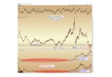
Below is a chart of the CRB Commodity Index from 1980 through the present, with relative strength comparisons between gold versus the CRB and silver versus the CRB below it:
Image A
The most important point to note on this chart is that worldwide commodity prices are currently at lows not seen in over 40 years.
Commodity prices are lower than they were during the dot-com bubble, lower than the recession of 2001, and – astonishingly – lower than during the worldwide financial crisis of 2008-2009.
To imagine that the global demand versus supply equilibrium for industrial & agricultural commodities is poorer than it was during the greatest financial crisis of our lifetimes is difficult to fathom – but it is exactly what the charts are telling us.
Precious Metals Relative Strength
Below the main chart are ratios showing gold versus the CRB and silver versus the CRB. These ratios show the relative strength between the precious metals and the 19-commodity CRB Index.
Here we can see that gold has outperformed the basket of commodities 300% since 2006, while silver has outperformed 350%.
Another data point we can reference is that while the CRB is now below its 2008 financial crisis lows, gold spot price is still well above its 2008 crash low ($680 per ounce), as is silver ($8.50 per ounce), respectively.
Thus… something happening to the precious metals that is not happening within other commodity markets.
Here is strong evidence that not all commodities are being treated the same within the investment world.
What is Relative Strength Telling Us?
This out performance since 2006 is in stark contrast to the near tandem price action that bound precious metals to the rest of the commodity complex between 1982 and 2006. This performance is visible from the nearly flat-line on the relative strength charts during that time frame (red highlights).
We speculate that starting around 2006, amidst increased monetary debasement by central banks and unsustainable debt loads by a world government, a certain portion of investors began to favor the precious metals for their historic monetary roles. This is a demand that is above and beyond the usage the metals have in industrial fabrication, which is what was appearing across the rest of the commodity complex.
We anticipate that the divergence between precious metals and other commodities which started in 2006 will be seen as the initial stages of what will become a larger worldwide phenomenon over the coming decade.
Applying Relative Strength
It is important to note that relative strength indicators are best observed as markets are declining – because we can see evidence of underlying accumulation happening behind the scenes. What we see is that physical buyers have been accumulating precious metals even as their prices were falling alongside other commodities.
Rising relative strength is important to observe during declines because it shows us which sectors should lead when the overall commodity complex finally bottoms. For example, it is likely that oil bottomed in early 2016 at $26 per barrel and natural gas bottomed similarly at $1.60 per million British Thermal Units (mmBTU).
While there will be opportunities across the entire commodity complex over the next several years, relative strength indicators are telling us that precious metals are poised to lead the advance higher as stabilization occurs across the entire commodity spectrum.
Christopher Aaron,
Bullion Exchanges Market Analyst
Christopher Aaron has been trading in the commodity and financial markets since the early 2000's. He began his career as an intelligence analyst for the Central Intelligence Agency, where he specialized in the creation and interpretation of the pattern of life mapping in Afghanistan and Iraq.
Technical analysis shares many similarities with mapping: both are based on the observations of repeating and imbedded patterns in human nature.
His strategy of blending behavioral and technical analysis has helped him and his clients to identify both long-term market cycles and short-term opportunities for profit.
Share:


